


Have you ever wondered what the average response rate to a satisfaction survey is, or more generally, to an online survey? There are few published statistics on the topic. But it’s still an important question, essential even, to know whether your campaign response rate is satisfactory or in need of improvement. To make up for...

Have you ever wondered what the average response rate to a satisfaction survey is, or more generally, to an online survey? There are few published statistics on the topic. But it’s still an important question, essential even, to know whether your campaign response rate is satisfactory or in need of improvement.
To make up for this shortcoming and to help you assess your survey campaign performance, we’ve analysed the statistics of campaigns deployed by Skeepers users to give you a reliable general idea.
Skeepers’s response rate is calculated based on the completed and partial responses (unfinished but with at least one save button), i.e., saved responses (including partially completed ones) in relation to the viewed surveys.
Find out the average online survey response rate, according to the size of a business, sector, deployment medium, format, etc.
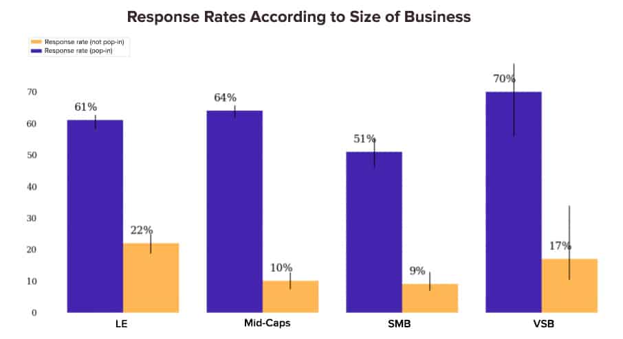
Survey Response Rates Vary According to Size of Business
It makes perfect sense that large businesses collect more customer feedback than VSBs.
Here are a few reminders before detailing the results:
- VSB = Very Small Business = less than 10 people.
- SMB = Small and Medium Business = less than 250 people.
- Mid-Caps = Medium sized Business = less than 5,000 people.
- LE = Large Enterprise = 5,000 people.
Here is an instructive diagram showing the response rate. VSBs have the best results. There is also evidence that large enterprises receive the highest response rate to Pop-up surveys. There are lots of possible explanations for this. It could be because LEs’ brand image is stronger than Mid-Caps’ and SMBs’. LEs are seen as more trustworthy.
This graph uses an essential analysis axis: Pop-up/ Non Pop-up. They can be distinguished as follows:
- Non Pop-up surveys. Respondents have to click for the first page of the survey to be displayed: click on a URL link, click on the first question in an email or on a website button, etc.
- Pop-up surveys. The survey is displayed to the respondent as a pop-up. The respondent doesn’t initiate the survey.
Non Pop-up surveys generate less responses than Pop-up surveys. This isn’t surprising. In the first case, (Non Pop-up surveys), the respondent initiates it.
However, these graphs help to see where you stand in relation to other businesses of your size. Let’s now look at how the response rate varies according to the industry.
Highly Variable Response Rates According to Sector
The Education, energy and luxury industries collect the most customer feedback. Of course, the number of responses goes hand in hand with the number of customers and the size of the business. Which is why it’s so useful to look at the response rate.
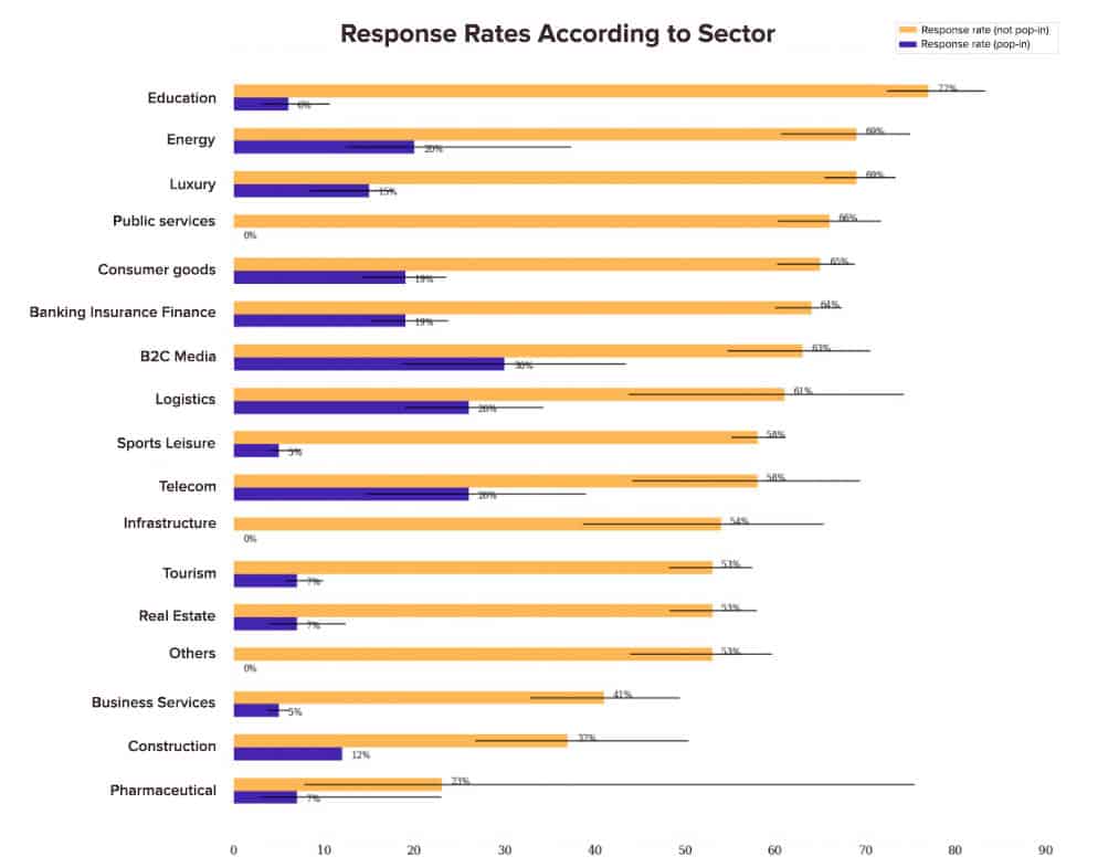
The response rate to Non-Popup surveys varies between 23% and 77% depending on the sector, and between 7% and 30% for Pop-up ones. Generally, these are the service sectors that see the best results.
Let’s look at another analysis axis.
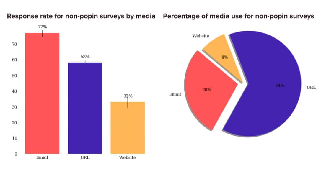
Response Rates also Vary According to Medium or Deployment Channel
We compared survey performance based on their deployment channel: URL, email, website, others. Here are the results:
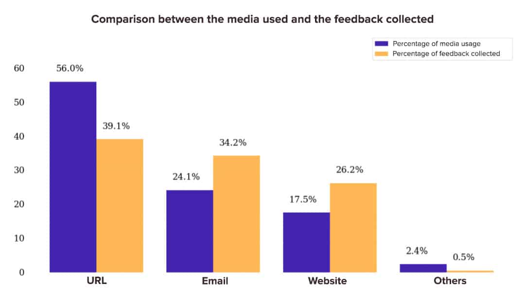
More than half of surveys are deployed through URL links, whether via social media or text, for example. URL surveys make up 56% of surveys but ‘only’ 39.1% of collected customer feedback.
In summary:
- Our customers and partners mainly use URL deployment.
- However, surveys deployed by email or on websites (pop-ups, banners, etc.) get the best response rates.
- Our advice is simple: take full advantage of email and website deployments.
What is the Best Deployment Method for Website Surveys?
If you want to deploy a survey on your website, there are several options and formats: topbars, buttons, exit pop-ups, banners, etc. Which works the best and allows you to get the best survey response rate? We’ve crunched the numbers for you. Here are the results of our investigation:
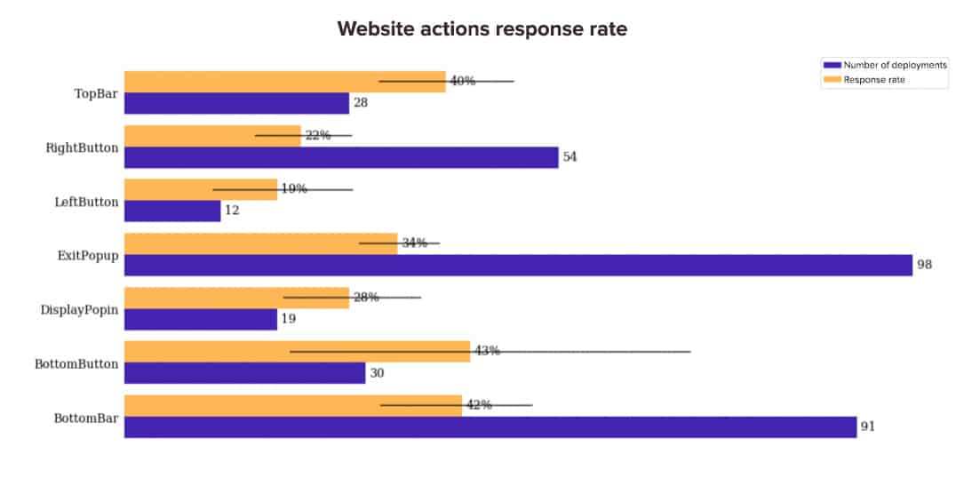
The three formats that get the best response rate are: topbars, bottom bars and bottom buttons. Which leads to the conclusion that, generally speaking, placing the survey at the top and bottom of a page is more effective than on the side.
Does the Number of Questions on the First Page of a Survey Impact your Survey Response Rate?
In order to carry out the following analysis, we only used a dataset with deployments that include a submit button on the first page. The following graph shows the amount of feedback and the response rate of customer feedback according to the number of questions on the first page of the survey.
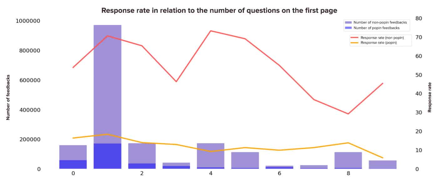
These are the two main findings of this analysis:
- There are a lot of deployments with a single question.
- However, no clear trend emerges in terms of response rate. The surveys that show only one question on the first page have a higher response rate but the same can be said for surveys that have 4 questions on the first page… To find out the most efficient number of questions for YOUR audience, try different things. Beyond best practices, the test & learn approach is key to continually optimising survey campaign performance.
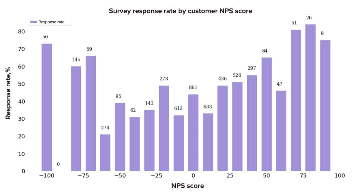
Survey Response Rates Vary According to Customer Profile (NPS)
We grouped the survey’s response rate and customer’s NPS profile together. The results tell us a lot.
The more customers with very high or very low NPS scores, the higher the response rate. In other words, very unhappy customers, or on the contrary, very satisfied ones are those that respond the most to surveys. This makes sense as we tend to respond to satisfaction surveys to express great satisfaction or great dissatisfaction.
Average ChatSurvey Response Rates
MyFeelBack allows you to deploy surveys on websites in a chat format: ChatSurveys.
Is the response rate to online surveys deployed in a chat format better, or worse than the response rate to a classic survey? We’ve analysed the data to find possible answers. Here’s what we discovered:
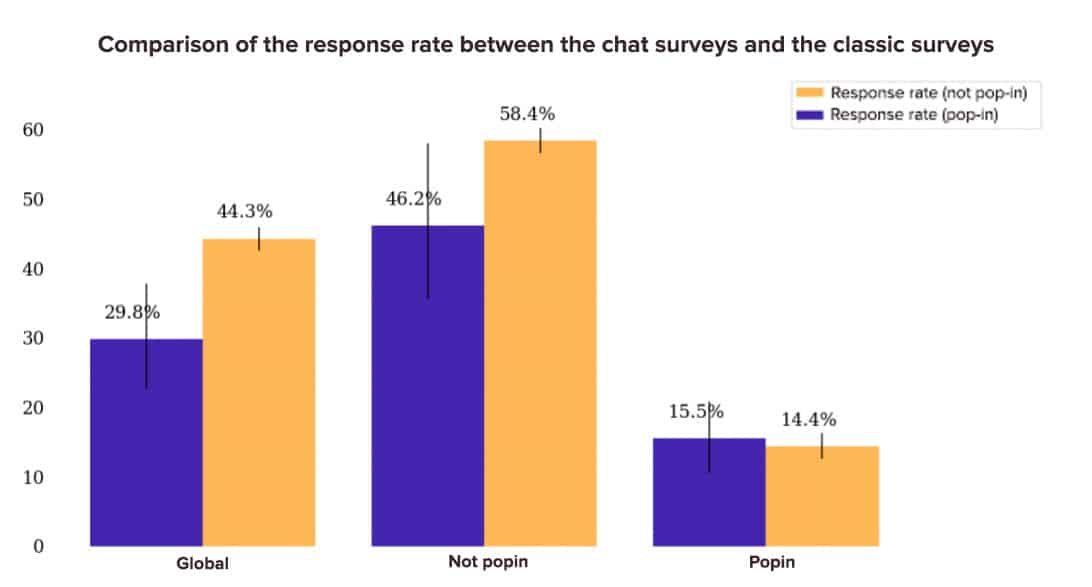
Generally, classic surveys have a better conversion rate than conversational surveys on non pop-up deployments. It seems that on Pop-ups, ChatSurvey has a better response rate, but the difference is not significant. We would need to expand the data sample analysed to validate the theory.
The Impact of Survey Personalisation on Response Rates
Is it good practice to include a personalised question on the first page of a survey? Here are the results of our analysis:
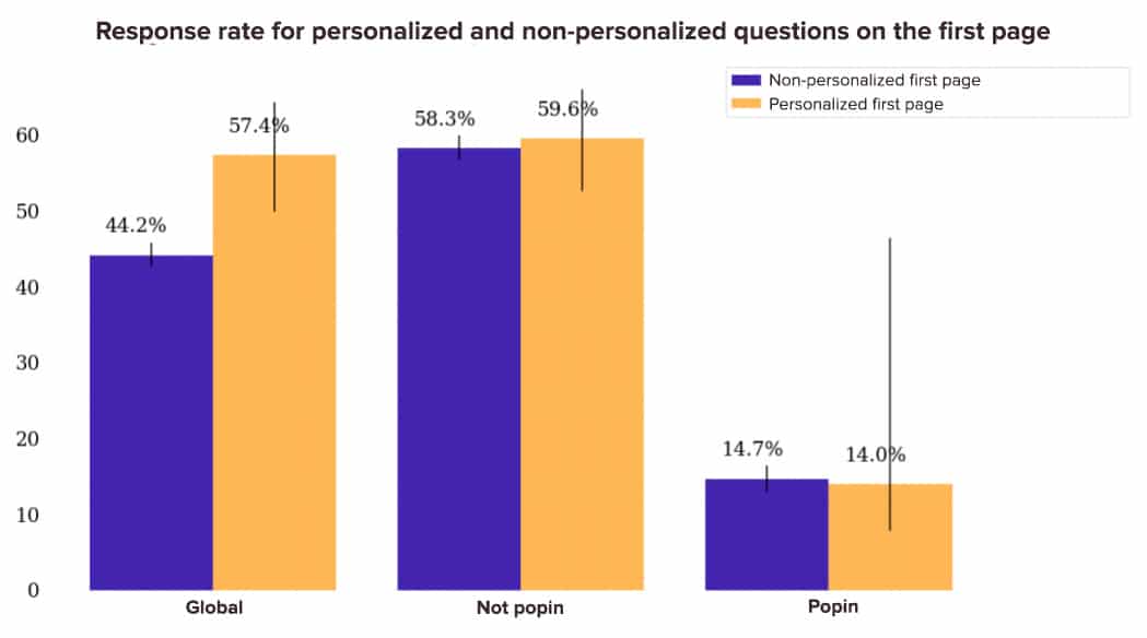
If we look at the overall response rate, it seems that including a personalised question first has a very positive impact on the response rate. However, when you differentiate Pop-up and non Pop-up deployments, the performance gap is very small. This is because the amount of feedback and visits on the non-personalised Pop-up deployments is much higher and pulls down the overall response rate. In our data sample, we actually have 487 non-personalised Pop-up deployments compared to only 4 personalised Pop-up deployments. Hence the importance of separating the Pop-up and non Pop-up analyses.
Comparison of Survey Response Rates by Device
Does the response rate vary depending on the respondent’s device? The answer lies in the following graph:
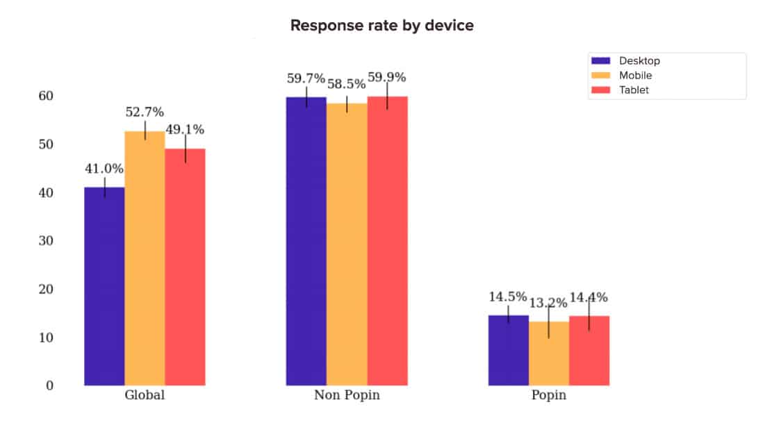
Generally, the differences aren’t very significant. Let’s go further in our analysis and compare the response rate of different mediums on devices:
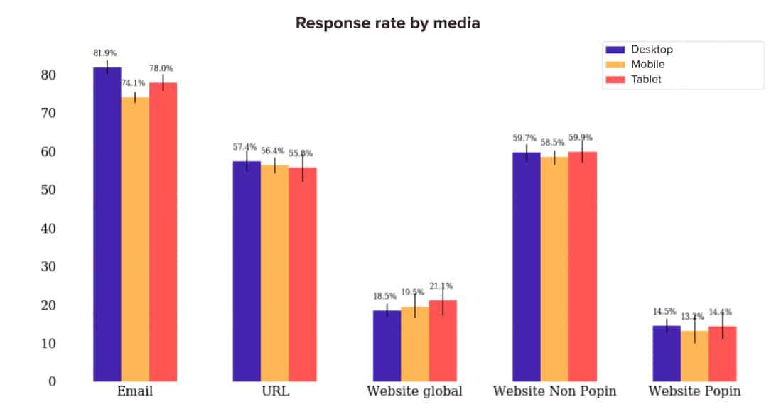
Only one significant result emerges, and it relates to email. The response rate of surveys deployed by email is higher on Desktop than on Tablet and higher on Tablet than on Mobile.
That sums up what we can say about the average survey response rate. It’s important to take a step back, of course, from the data we’ve shown you. But we hope that all of these statistics have given you an idea of an online survey’s average performance.