


True or false? People hate being told what to do.
If you’re a teacher, a police officer, or a mother, you might definitely think that this answer is FALSE.
But if you’re a marketer, you know that the answer is actually true.
People love being told what to do, as long as they don’t feel like their freedom is being restricted or like they are being forced into something.
More often than not, people actually love being guided. It’s just all about how you do the guiding.
This is why subtle, helpful, and empowering marketing is so successful, and why intrusive, annoying cold calls and pushy sales people are so enraging.
We like being told what to do, we just don’t like FEELING like we’re being told what to do. So as a CMO, it is your job to successfully guide people through a specific process with clear, easy to understand guidelines.
This is true when you are creating a lead converting website, it is true when you’re sending out a drip campaign, and it is especially true when you are creating a customer feedback survey that you are hoping to get a high response rate on.
This article discusses how to make your survey appealing to your readers by using CTAs to make the survey taking process easy, satisfying, and fun.
CTAs are your customer’s roadmap through your digital content
Getting customers to open your customer survey is a common challenge for anyone trying to build up their customer knowledge and improve their customer experience.
You lose enough customers by people who are busy, tired of being asked, or simply skipping over the survey. So you can’t afford to lose any more customers by having a survey that turns people off once they begin taking it.
Unfortunately, this is often the case. Customers often exit out of surveys in the middle of the process because it takes longer than expected, is too confusing, has an unpleasant format or interface, or because it requires too many written responses.
This means that if you want your survey to be worth the effort, you need to make sure that it is as fun and painless to take as possible.
Paying attention to what CTAs you include in the survey will help you to create an easy and intuitive experience for your customer that will motivate them to stay on the survey until the end.
CTAs need to be clear, concise directives that show your customer what to do next. They should be frequent enough to give a clear pattern and adequate guidance, but also not be too numerous to the point that it is overwhelming.
Some examples of great CTAs in surveys would be:

And anything else that the customer needs to click on in order to continue or finish taking the survey.
Unlike typical CTAs, on websites or anywhere else, these survey CTAs usually aren’t trying to sell you on enrolling in a service or buying a product, but are trying to urge you into continuing to engage in the survey. That means that they need to be less subtle, and more instructional. The last thing you want someone wondering when they take your survey is, “What do I do next?”
So, what makes a survey CTA good or bad? There are a few main things to look out for.
Color, size, and shape
Do not underestimate the importance of the look and feel of your survey, including your CTAs. Dry, boring surveys are getting more and more outdated. Most companies just send out a plain colored bulleted list of questions, and this does absolutely nothing to market your product and grow your engagement.
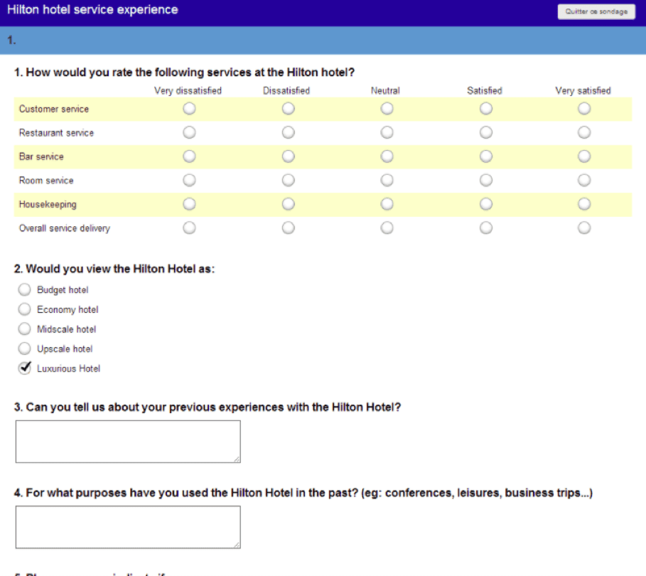
An example of a dry, outdated customer satisfaction survey from Hilton.
When your customers are asked to participate in multiple feedback surveys every month, there should be something about yours that sets it apart from the rest. Having a nicely formatted survey with eye catching CTAs is a great way to do this. Customers will be more responsive to something that looks like a piece of material that is branded and properly formatted the way the rest of your marketing materials are.
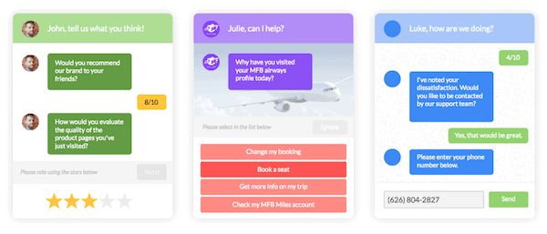
MyFeelBack offers survey options with colorful, catchy CTAs and a sleek modern format.
Wording
Another thing you should consider with your CTAs is using effective wording to stand out and engage your reader. “Continue” Buttons, question responses, and any other CTA on your survey page are great opportunities to add a little bit of style and flair to your brand.
Instead of saying “Begin”, you can say, “Let’s go!”, “Onward!” can replace “Next”, and “I’m not sure/I don’t care” can replace “I don’t know” as a response option.
Instead of saying “Tell me more”, be more specific about what you want your customers to talk about by saying something like “Use this space to tell us 2 things that disappointed you about your experience on our flight.”
Again, people like being told what to do, and limiting the scope of the question down in this way will help you to get more effective answers and to get more complete responses.
CTAs aren’t rocket science, but they are important details to get right and they can determine whether or not your participants fill out your survey all the way to the “submit” button, or don’t even bother opening the email. Take the time to make these small changes to your CTA to make sure you are giving your survey the best shot it has at giving you real customer knowledge and feedback.
// ><!